3X development speed by building the Design System
Led the problem discovery, solution alignment, design, UX copywriting, and overall design standards for the Rainbow Design System.
CLIENT
Webconnex
Role
Lead Product Designer
RESPONSIBILITIES
Design System Strategy
UI Component Design
Design Tokens & Foundations
Figma Library Architecture
Documentation & Guidelines
Design–Engineering Collaboration
Cross-functional Leadership
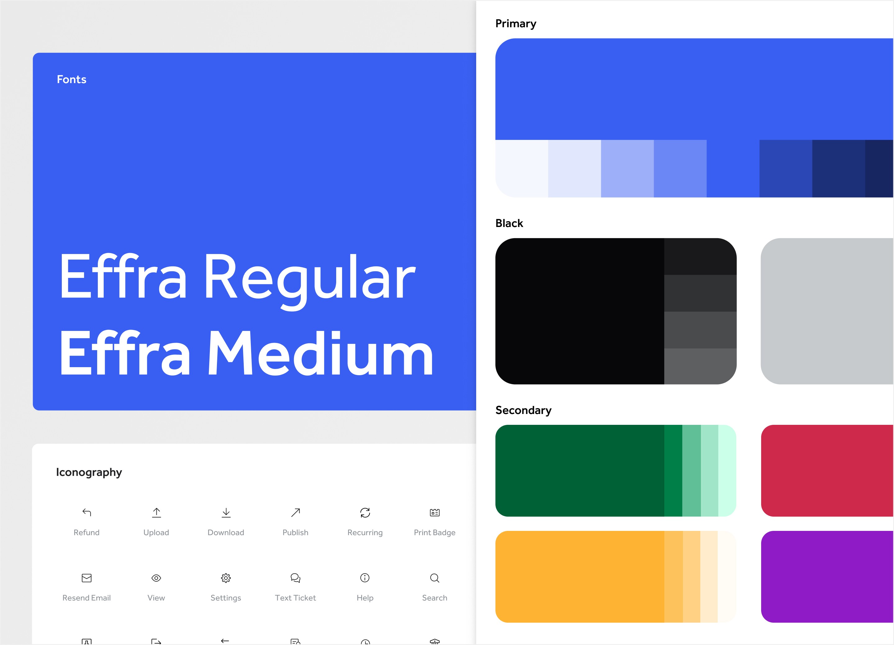


Webconnex is a 150-person SaaS company with four core products covering events, registration, ticketing, & fundraising. Our Rainbow Design System was created to solve design and development scaling issues within our customer control panel interface.
Timeline
Multi-year project
Phase 1: Style guide and testing it on project designs.
Phase 2: Problem discovery, UI audit, develop principles, foundations, components, then test, update and expand.
Phase 3: Accessibility updates and brand parity.
Team
A remote team spread across 3 different timezones.
1 Lead Designer (myself)
1 Product Designer
1 UX Engineer
3 supporting Front-End Engineers
Webconnex’s Rainbow Design System serves:
3
Designers
40
Engineers
40,000+
Customers’ event and fundraising management
3X’d Dev Speed
Interface build speed increased dramatically after the launch of Rainbow Design System.
50% Faster Decisions
The design system put all product conversations into clearly defined boundaries before even starting.
Large Scope / Small Team
Increased the velocity of product design team output so much that we transitioned one of our designers to the marketing and brand team.
A simple style guide to bring consistency to our growing product and design.

When I first arrived, I worked with our CPO and engineering team to design and build out a working style guide. I created these base level styles in a Figma document. I started utilizing Figma variables and styles.
This served us well initially, but as our team grew and we extended the style guide across more projects, we began to uncover limitations.
Design Issues: a growing list of inconsistencies in our interfaces
Lack of Guidelines: designers approached interfaces differently from project to project
Process Problems: a lack of clear design constraints led to project bloat
We felt these issues first with buttons. It was not necessarily in their visual style, but in their placement, language, and application. The same friction surfaced across content and form layouts, text patterns, and responsive UI.
Learning
The more projects we worked on, the more we could see that a style guide would not help us scale our design, product, and engineering efforts.
The problems were bigger than our UI. I needed to understand what was really breaking down.
We were experiencing a problem we couldn’t quite put our finger on. Something wasn’t working in our UI, our Style Guide, or our approach to design.
I talked to members of different teams to assess the scope of the problem. I spoke with the engineering architect, the lead product manager, senior product designer, UX engineer, and several front-end developers.
After gathering feedback from multiple teams, I created a pitch deck for stakeholders that included a few high-level problems that surfaced.

Problem Discovery
As designers, we were meeting the needs of each moment as the opportunity presented itself, while engineers would customize styles or components as needed without any oversight.
Our design direction lacked focus. We repeatedly delayed timelines, pulled engineers out of other projects with questions, and raised the product manager's blood pressure.
Over time, we discovered a tension in our user interface between key components like actions, content, layout, and more.
We were failing to meet our customer’s expectations.
Results
I built stakeholder alignment around the problem space and opportunity and requested room to explore the problem more and find solutions.
Stopped looking at screens individually and looked at the product as a whole.

We didn’t need a few changes, we needed a better approach. I flew to Sacramento for two days to meet the product designer and UX Engineer so we could assess the situation together.
They pointed me to Karri Saarinen’s Building a Design Language article. His approach to UI Audits immediately stood out as something we could try. I printed every screen in the customer control panel, nearly 200 pieces of paper. Tables, dialog boxes, dropdowns, expanded sections, and forms. Lots and lots of forms.
A key pain point for us was not UI elements alone, but their context to the larger story. We needed to see everything and how they played together. We took over a conference room, and laid every printed interface across a giant table and all over the floor.
With sticky notes and pens in hand, the goal was to not overly prescribe solutions, but instead to call out symptoms and where we found them. We each had a different take on the screens.

We finished assessing the screens, and placed all of the sticky notes across an open wall. We stepped back and began to group the notes by UI element. Many UI elements were clumsy or frustrating, while others clearly affected a larger portion of our overall product design. Buttons, tables, typography, modals, forms; we had a sense of our biggest pain points. The volume of sticky notes pointed to our inconsistency of style, application and layout. Our problem was not our original style guide, but that we lacked a plan on how to execute it. Our product lacked a shared experience throughout.
Learning
The experience was invaluable for our team. We came to a collective epiphany, which deepened our buy-in to both this idea of starting and developing a design system, as well as our connection as a design team.
Results
5 major categories for improvement: Influencing these categories would have the largest impact across all of our UIs and customer experience.
Established principles, guidelines and layouts that gave our components a philosophy and boundaries to design within.
The 5 Problem Categories:
Hierarchy
Content framework
Calls-to-action guidelines
Modal structure and use
Table consistency
Guiding Principles: We wanted our UI/UX to be...
Readable: text color, contrast, spacing and size aimed at higher readability and scanability.
Conventional: follow expected UI conventions to build familiarity and confidence.
Consistent: maintain design consistency to reduce user friction.
Less is more: create a small set of powerful and useful components that can be used to their fullest.
Mobile Friendly: make software accessible and useful across screen sizes.
To pressure-test these problem categories using our focused design principles, I created low fidelity wireframes that resembled home builder floor plans.

Mapped out each screen, and I began to get vision for each component’s place, purpose and limitations.
Labeled different content blocks, which were a collection of components. Each block would help a user answer questions like where am i, what am I looking at, what can I do here, what can I do next?
Limited the page types to three widths, which refined and limited our options.
Trimmed down the number of content blocks and their applications, but within each, there was quite a bit of flexibility. Actions, previously called controls, became a robust component we could expand and collapse for different use cases. And finally, mobile became a priority in our new design system.
Simplified our large variety of layouts, placements and user flows into 3 core layouts.

Learning
I was surprised by the flexibility these new constraints presented. For instance, actions became a robust component we could expand and collapse for different use cases, which opened up possibilities for mobile friendly interfaces.
Simplifying components into crude, low-fi floor plans helped us distinguish design from purpose; to see the intention of each tool.
I used our floor plans to make sure our customers could accomplish their intended outcome as they move from room to room in the same house.
Results
Constraints create clarity, good discussion, and better solutions.
With the principles and boundaries in place, we could finally build the system itself.
We started with foundations because a design system builds layer upon layer. We wanted this next phase of our design work to be solid and scalable.
We stared small, intentional, and addressed issues as they presented themselves so we could grow the design system as needed, not artificially.
Tokenized units grounded our spacing and typography into increments of 4px or 8px creating a concise foundation for padding, margin, font size, and line height.

New color rules focused on readability and clickability.


Readability: We increased the saturation, decreased the brightness, and better aligned the hues on our existing color palette to give the grays more contrast and make the primaries pop.
Clickability: We no longer allowed color to be flourish or flair, but the primary use of color is that color communicates clickability.
Taking cues from Shopify's Polaris and Flexport's Latitude design systems, I developed a landscape for language including our system grammar, formatting and terminology, and honed in our voice and tone. Our team knew our audience and how we wanted to talk to them.

Previously littered with titles, text and layouts in a variety of sizes, colors and placements, I founded our new hierarchy on page titles that are larger, bolder and with more contrast.


Established two key headline types:
Emphasize where I am in the platform or whose "attendee details" I am viewing.
From here, all other headlines and text must live in a box container, and hierarchy top-down rules apply from an H2 down to labels and help text.

Organized these redesigned interfaces by emphasis, size, placement and order.
Emphasis and Size
Created more button attributes to work with like emphasis, size, the option for icon, and a mobile-sized button to better fit on smaller screens.
Placement
I limited placement to the top right (To create or initiate a new item), or bottom left (To save or cancel).
Additional calls-to-action could be integrated into our content flow. While these guidelines appear elementary, they provided clear buffers for designers (but mostly stakeholders :) ) who kept wanting to fill empty space with actions.

Order
Our previous grid gave us too many options to mix and match content based on the needs of the moment. We moved to a top to bottom / left to right content flow. This pushed us to create better content patterns with labeled sections.
Our button placement previously followed a Gutenberg diagram, but I appreciated Artem Syzonenko's thinking on this subject. He posed the idea that actions are presented in a sort of conversational flow, where we are presenting the primary or most obvious options first. We mimicked Syzonenko's flow.
Form order, alignment and language were disjointed. We introduced a new legend / field label hierarchy to better organize the many inputs, and we created label language parameters to make forms easier to read and understand.
Tested the Design System in real-world projects, assessing its value, addressing new needs, and establishing governance.

Utilized our new design system to design the revised events CRM project. We refined certain design guidelines, but mostly learned to design within our new constraints.
I assigned the UX Engineer to lead the Design System governance. She established a workflow for requests and updates, and would loop me in for design review and updates to patterns or guidelines.
Learning
Clear boundaries gave us focus instead of limiting our creativity.
Fewer options meant fewer decisions, and somehow, better ones.
Results
50% faster decisions as design and engineering collaborate and create from the same foundations.
3x faster engineering build time with a shared foundation and a much clearer path from design to code.
Strengthened the system through accessibility improvements and incorporating brand elements.
Years after the inception of the design system, our marketing team developed a new visual identity, including new brand colors that did not match our design system.
At the same time, a new customer category, higher ed, entered the scene that required a higher standard for accessibility. We wanted to take this moment to both make our colors and components more accessible, while also adjusting the hues to better align with our brand colors.
As we assessed our customer control panel through accessibility readers, I started improving our colors, while our UX engineer tackled improving our navigation to be more keyboard-usable.

Steps to improve colors
In Figma, I collected our current design system colors, new brand colors, and snippets of design elements from other projects to see how we use colors in different use cases. I adjusted the hue so it better complimented our brand.
I tested each new base hue on the Adobe Color Contrast Analyzer, making quite a few adjustments along the way.
I created a color scale that gave us proper tints for light and dark backgrounds.
Results
Updated the design system with accessible colors that are a clear extension of our brand.
Our UX engineer updated many navigation accessibility hurdles.
Launched and iterated Webconnex's Rainbow Design System
Design Principles
The underlying UX philosophy that guides decisions
Design Guidelines
The design system put all product conversations into clearly defined boundaries.
Design Patterns
Repeatable solutions to common interaction problems.
Design System
Components, tokens, styles, foundations
